0:00Hey, it's Tim here in the Tableau
0:01conference keynote right at the end of devs
0:03on stage, they really did save the best
0:05till last. Tableau showed off an augmented
0:08reality demo that I think blew my mind away
0:10when the first time I saw it. And I also
0:12have a bit of an apology and a confession
0:15to make during this video. If you want to
0:17know more, let's get stuck in.
0:19Okay, so the only way for me to really sort
0:21of show you this is to just watch it
0:23together. And so we can kind of go through
0:25this. And what I will say is that you can
0:28find out more about this in the description
0:30, I've linked to all the relevant research
0:33papers by Tableau and a blog post talking
0:36more about it, as well as a video on Vimeo,
0:39which is from Tableau research talking
0:40about this topic.
0:41So let's first of all show you the demo. So
0:43you know what I'm talking about. Let's just
0:45start this video. Hopefully we can get this
0:47going findings and we can go into meeting.
0:50So let's have a look at the meetings we all
0:51have every day with our webcam on
0:53communicating with colleagues and
0:55communicating with customers.
0:57And I want data to be infused in those
0:59conversations, too. And I'm wondering, can
1:03Tableau help me here? I think we can. Up
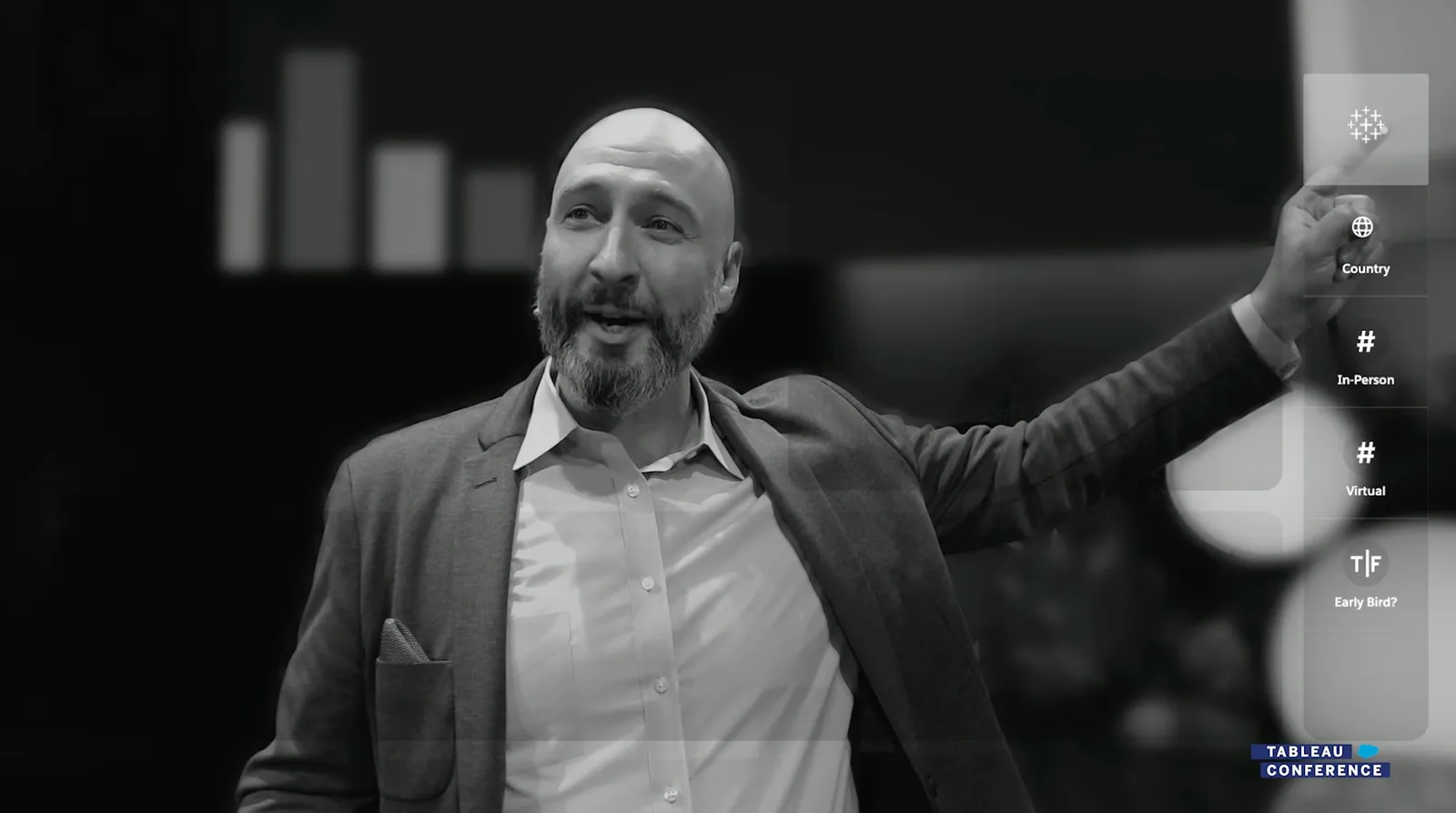
1:07here in the corner is the Tableau sparkle.
1:11I simply point at it and check that out. It
1:12's data.
1:14I love this every time. This is a dataset
1:29about the top countries attending outside
1:29of the US, the top international countries
1:29in attendance. And I'd like to see what
1:29this data can tell me. So I'll simply pinch
1:29, bring out country, and place it here.
1:29Then I bring out now you probably didn't
1:31pick it up in the audio, but the crowd when
1:33whoo. And this is incredible, because what
1:47's going on here is that Matt is on stage,
1:47there's no sort of staging, there's no
1:47special equipment is using a webcam, a
1:47standard webcam on the laptop, you can go
1:47watch the conference keynote, and you can
1:48see he's literally on stage in front of a
1:50basic webcam.
1:52And there's a backup webcam as well in case
1:54the one that he was using fails. But
1:56nonetheless, it's just a standard setup
1:59that anyone uses for zoom, Google Meet
2:01teams, all of those. This technology is
2:04going to work in that tool, as he himself
2:06says.
2:07And the first thing he did, if I just go
2:09back, is he points his finger and you can
2:12see that the system notices his finger and
2:15puts a little dot on the end of his finger,
2:17then he's able to use that to go and
2:20highlight Tableau. And when he highlights
2:22Tableau, the interface opens up with
2:23essentially the dimensions and measures as
2:24we call them in this case, country in
2:26person, virtual and early bed a Boolean
2:28field. So a very limited set of fields.
2:31But the crazy thing is, this is a different
2:33interface, this is a very different
2:35interface. And the whole setup for this is
2:38about not putting, well, putting the data
2:41between you and the person you're
2:42presenting, essentially, whereas normally,
2:45you're presenting a screen, you're
2:46presenting something else, and you can't
2:48really talk alongside of your data.
2:50And so the idea of this demo is it sent
2:52essentially allowing people to almost narr
2:55ate their data and visually show people what
2:57they're looking at. You can add a whole
3:00bunch of elements. If I just let this demo
3:02play on your sit, sort of start to come to
3:02life.
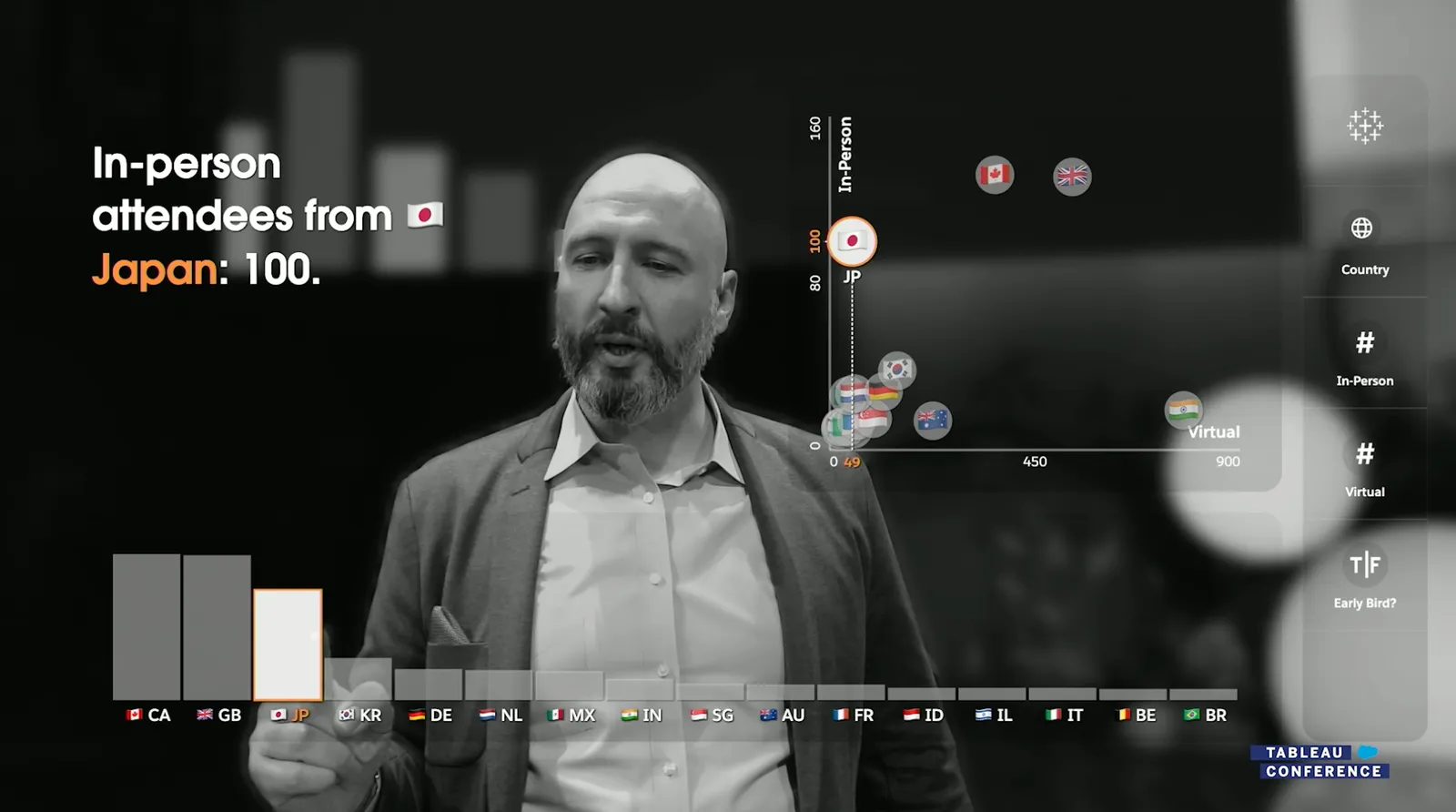
3:02Check that out. It's data. This is a data
3:20set about the top countries attending
3:20outside of the U.S., the top international
3:20countries in attendance. And I'd like to
3:21see what this data can tell me. So I'll
3:24simply pinch, bring out country, and place
3:24it here. Then I bring out in person and
3:25place it here as well. And there it is,
3:25Canada in the lead.
3:26It's pretty impressive. You can see he's
3:33doing it right on stage. It's a live demo.
3:34It's not cooked. This is why I have to
3:35explain my apology.
3:37My kids love playing with this. That's not
3:39in the script. I can also draw a reference
3:41line in the air with my finger to compare
3:43related values.
3:45It's really cool.
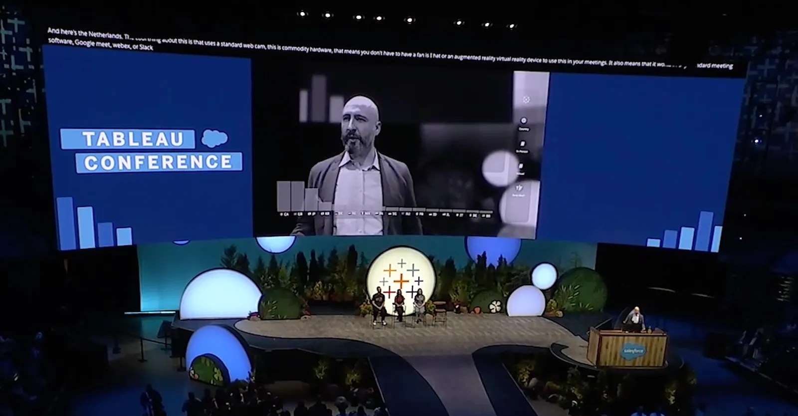
3:46Which is pretty awesome. And I see here's
3:49the Netherlands. I just ran into some of
3:51the Dutch folks this morning. The cool
3:54thing about this is that it uses a standard
3:57webcam, standard laptop. This is commodity
4:00hardware. That means you don't have to have
4:03a fancy hat or an augmented reality,
4:05virtual reality device.
4:07Now, the funny thing is, this is, I don't
4:10think many people got this reference, but a
4:13lot of technologies, AR demos in particular
4:16, require you to have headset.
4:19And the BI Bake Off with Gartner actually
4:23had different analytical partners, one of
4:28which is Microsoft, who of course have a
4:30HoloLens.
4:31This is something that Microsoft has
4:33pitched before, augmented reality analytics
4:35with the HoloLens. They've pitched this
4:38whole concept of one click BI.
4:40I actually got sent a clip by someone who
4:43was at the Gartner event as an attendee.
4:47They have a little clip basically showing
4:50all of these instances where this demo is
4:54being done, actually responding to some of
4:56those requests.
4:57And you can see the crowd there went
4:58absolutely crazy because of course they're
5:00seeing all these analytical tools basically
5:02go off against each other. They all have
5:04the same data set. They all have the same
5:06thing.
5:07And the crowd was absolutely loving. I
5:08think Tableau absolutely wiped the floor
5:10for the BI Bake Off. I'm pretty certain
5:13that's the case. They won it by a country
5:15mile.
5:16And it was because of this demo. This demo
5:18really was a really good pitch for the
5:20innovation happening at Tableau. And so you
5:22can kind of see this demo go on a little
5:24bit more.
5:25It also means that it works in any standard
5:30meeting software, Google Meet, WebEx, Teams
5:36, or Slack Huddles.
5:40This year, as in previous years, we have a
5:41number of virtual attendees who are here.
5:44Hi, welcome.
5:46And I want to understand where are those
5:48folks coming from. So I'll take country, I
5:51'll bring it out and place it on this drop
5:54zone. Then I'll bring in person to the Y
5:56axis.
5:57And I'll take virtual attendees and place
5:59it on the X axis. And look at that. A
6:02number of things are immediately apparent
6:04in the data. First of all, we have a number
6:06of folks here virtually from India. Welcome
6:08. We're glad you're here.
6:13Whereas another interesting outlier that we
6:15can see just by pointing, notice that the
6:17values are linked up between the bar chart
6:19and the scatter plot.
6:21We have a large number of Jami attendees
6:23who made the whole trip over here. Welcome.
6:26Arigato.
6:32One more thing. This is geographic data. So
6:35I'd like to see it on a map. Let's see what
6:37's possible. We'll bring out country, place
6:40it on the drop zone, and now we have a
6:43globe.
6:44We'll take in person attendees and bring
6:46that out. And now you have a choropleth map
6:48showing attendees around the entire world.
6:51Well, that's great, but this is a globe.
6:54How do I see the rest of the world?
6:56That's right. We just pinch and that
7:02reaction is incredible. Yeah, just like a 3
7:03D globe in augmented reality.
7:05I can share and the data goes full screen
7:06and our faces all get pushed to the side
7:08and the data dominates the conversation.
7:11That's not what we want, is it?
7:13We want data infused in the conversation.
7:15And this is the message and the messenger
7:18together. That's the power.
7:20That's the real message. Seeing and
7:21understanding data. That is the power of
7:23Tableau.
7:25There you go. And he closes it and exits it
7:27. And you can see it's just a standard
7:29webcam. And that's the end of the demo.
7:31This is absolutely incredible.
7:34Now, this technology still has a long way
7:36to go, of course. And there's a lot of
7:38things to work out.
7:40So many of our dashboards today in a
7:41business context that are presented are so
7:43much more advanced than this sort of simple
7:45setup.
7:46But you can actually start to see if you
7:48think back to individuals like Hans Rosling
7:52and how he narrated human development.
7:55You can actually start to see that that
7:56kind of demo, that kind of narrative demo
7:58is almost potentially possible with this
8:01technology.
8:02And that's probably going to be for me the
8:04benchmark. When I get my hands on this, I
8:07will try and see if I can do Hans Rosling's
8:09demo nowhere near as good as him.
8:11But if I can do it with the dataset and
8:12with the elements here in Tableau, then I
8:15think Tableau has achieved something
8:17incredible.
8:18Now, why do I owe Tableau an apology? Well,
8:22a while back, we had this post on LinkedIn
8:29and it was actually off the back of the G
8:31artner Bake Off.
8:32And you can see that the reaction on this
8:33was super positive. Tons of people really,
8:36really like this.
8:38And when I watch this for the first time,
8:40there's a curse when you make videos where
8:42you start to watch the video, trying to
8:44critique the technique, the production
8:47behind it.
8:48And so when I watch this, the first thing I
8:50notice is that, wait a minute, how is Matt
8:52controlling these assets?
8:54To me, the letters and the information is
8:56displaying correctly. But then Matt has to
8:59be looking at it backwards, surely, right?
9:02Unless he's looking at a mirror, he has to
9:05be looking at this backwards. And so he's
9:08not sitting in front of this.
9:08Like in a police station, you get these one
9:10-way mirrors where you can see one way, but
9:13you can't see the other way.
9:15It just comes back as a mirror. That's
9:17clearly not the demo here because not every
9:19business has that kind of setup.
9:21So I look to this and I call this as a
9:23visual effects conceptual video demo.
9:27And then I went on a little bit of a trail
9:29because I kind of wanted to call out this
9:31demo, but I needed to really make sure that
9:34I knew my stuff.
9:35And it turns out I was way off the mark.
9:38So Matt posted this post and it linked to
9:41another article, which was this one here by
9:44Matthew Bremer.
9:46Now, Matthew Bremer is a researcher at
9:47Tableau. He's probably the person I owe an
9:49apology to.
9:50But him and his team have been researching
9:52this concept called augmented a cherenomia
9:55for presenting data to remote audiences.
9:58So cherenomia is that sort of technique
10:00where you're using your hand and finger
10:02pointing to control things in this sort of
10:04space.
10:05And so Matt and his team, this is actually
10:08not an academic paper. It's actually a demo
10:10.
10:11And in the demo is a video. And so let's
10:13just play this as well.
10:15So let's just I'm going to skip through it
10:17and you can see that they actually get a
10:20very early example of this.
10:22However, when nine months ago, you can see
10:23working really, really well.
10:25Let me just turn the volume down so it
10:26doesn't talk over me. And you can see that
10:28it's working here as described.
10:30But this is a very, very early concept.
10:32Obviously, the UI is slightly different.
10:34Doesn't quite have the polish of what we
10:35saw at keynote. So it's moved on a little
10:37bit.
10:38But you can really clear it's exact. See,
10:39it's clearly the exact same technology.
10:42And you have to kind of watch until the end
10:44.
10:45And this is this is when I sort of my mind
10:47blew up because I saw that little piece at
10:50the end where they're showing you the setup
10:52they were using.
10:53And you can see here very clearly, it's
10:55just a webcam. And what it's actually doing
10:57is reflecting the WebView to you.
11:00So what you're actually controlling is one
11:02to one mirroring.
11:03It's a bit like me touching a wall and
11:05seeing a mirror in my hand and touch my
11:07hand because I'm actually able to see what
11:09I'm doing.
11:10This is exactly the same, exactly the same
11:11concept. And you can see a range of
11:13different charts.
11:14So this is research that simply sort of
11:15moved on and you can see the chart behind
11:17it and how it's all working as well, which
11:20is super interesting as well.
11:22So that is why I owe the research team at
11:24least an apology on this particular one,
11:28because, yeah, I didn't think it was real.
11:30I thought it was fake. And then when I dug
11:32into it, yeah, found out that I was I was
11:34wrong.
11:35So sometimes you get these things wrong.
11:37Now, there is one last point.
11:40Tableau once had an app called Tableau Vis
11:42ible. In fact, I still have it on my iPad
11:45and I will do a video on Visible maybe in a
11:47couple of weeks time because I still have
11:49it on my iPad.
11:50It unbelievably still works. But what I
11:52think that app has that I think this
11:55technology could benefit from going forward
11:59is that that Visible app had a lot of
12:01gestures nailed down.
12:03The way you sorted, the way you selected
12:05data, the way you interacted with data was
12:07unlike anything else in the Tableau
12:09platform.
12:10It's probably the best innovation that I've
12:12ever seen inside of Tableau in a long while
12:14, because it was a completely different
12:16interface to working with your data.
12:18And so much so that basically there's no
12:20recollection. If you search Visible, all
12:21the blog posts are gone.
12:23I found this one because it's a press
12:25release. These don't get deleted. But in a
12:27separate video, I'll go through Tableau Vis
12:29ible.
12:30I'll talk about it as the product that got
12:31canned or whatever. We'll talk about it in
12:33some other context.
12:35I'll show you through the app and I'll show
12:37you how some of the technology there could
12:39be paired with this to make something truly
12:41amazing for the future.
12:43Anyway, thanks for watching. I'll catch you
12:44in the next video.
12:46Yeah.
12:47You.
12:49You.
12:56[ Silence ]