How to build Maps in Tableau | Tableau Charts
Maps are super simple in Tableau, but a few details can trip you up if you don't know where to look.
- Double-clicking any geographical field (marked with a globe icon) generates a dot map automatically, and you can encode values like sales onto size
- Switch from a dot map to a filled map via the marks pane, then use colour rather than size to encode values since geographical areas are fixed
- If Tableau doesn't recognise a field as geographical, assign it a geographical role via the field dropdown to enable mapping
- Resolve 'unknown places' by editing locations and pointing Tableau to a country/region field to disambiguate locations with shared names
- Customise map appearance through background maps, background layers, and opacity to switch on or off details like roads, water and neighbourhoods
Building dot maps
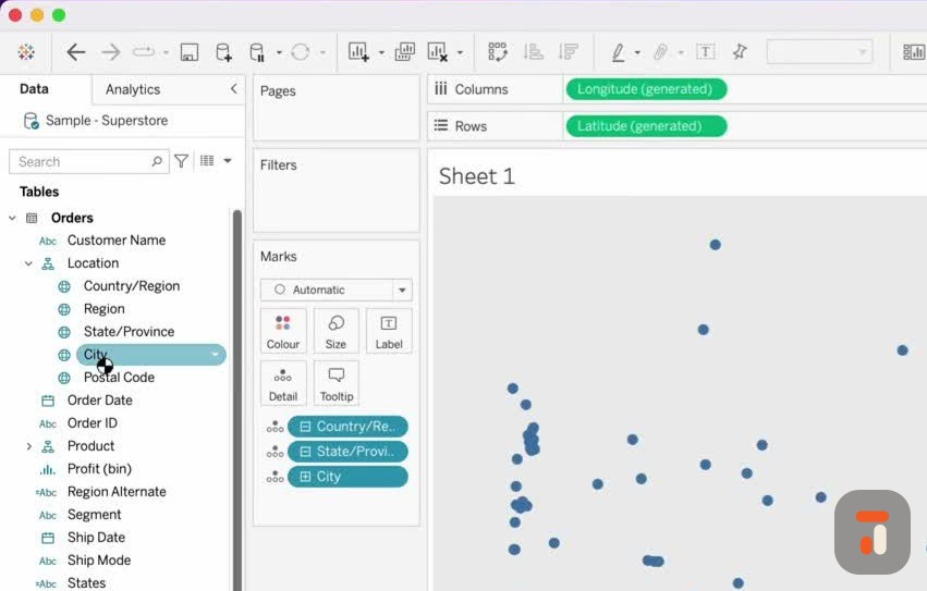
Maps in Tableau are some of my favourite visualisations because they’re so simple, yet a few small details can trip you up if you don’t know what to look for.
Any geographical field in Tableau is marked with a globe icon, and they’re often arranged into a location hierarchy. If you double-click one of these fields, Tableau assumes you want to build a map. Double-click on City and you’ll get a dot map with every city plotted as a circle. Clear the sheet and double-click State instead, and you’ll get a dot map of all the states.
The nice thing about dot maps is that you can add context to those dots. Drop your sales value onto size, and each circle resizes according to its sales. It really is that easy.
Creating filled maps
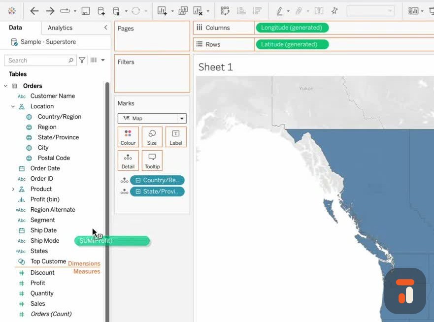
Sometimes you’d rather show a filled map. Clear the sheet, double-click State again, and head to the marks pane. By default the mark type is set to circle, so switch it to the filled map option and you’ll instantly get a filled map.
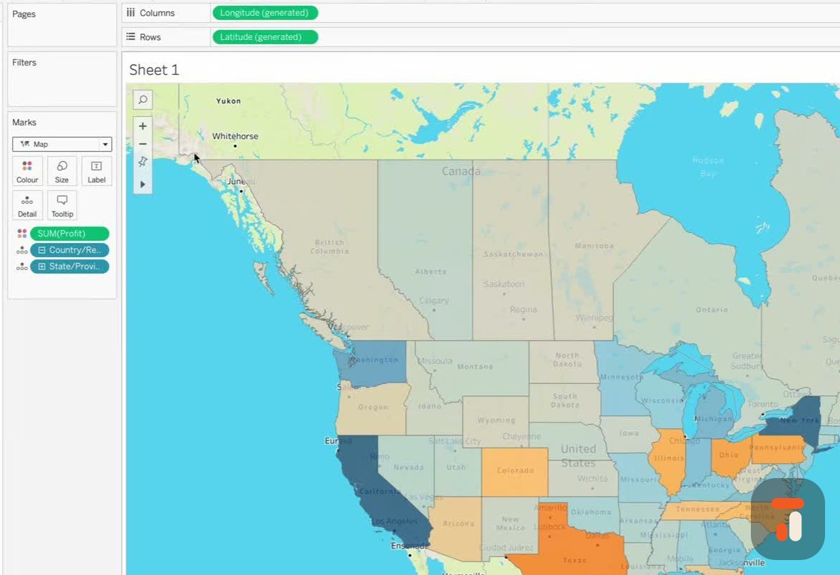
For a filled map it makes far more sense to encode your value onto colour rather than size, because the geographical area of each state can’t change. Put sales on colour and each state shades according to its sales. Try something more interesting like profit and you’ll start to see a story emerging across the regions.
Styling and background maps
You can style your maps too. Go up to the Map option, choose Background Maps, and switch between different background styles. Map Options gives you a hover panel for finer control over how the map behaves.
The real power sits under Background Layers, which lets you customise the map far more, switching individual details on and off so the map shows exactly what you want.
Fixing unrecognised geographical fields
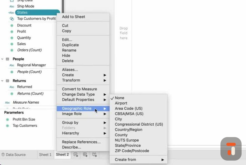

Sometimes when you open a dataset, Tableau doesn’t recognise your fields as locations. You might have a clean set of geographical fields up top, but further down some suspicious items like an alternate states field or an alternate region that aren’t showing the globe icon.
Tableau ships with a built-in dataset of known locations around the world, and you can use it to tell Tableau what a field represents. Select your states field, open its dropdown, go to Geographical Role, and you’ll see the location types Tableau knows about, airports, area codes, cities, congressional districts and more. Tell Tableau this field is a State/Province, and the geographical icon appears straight away. Double-click it and the map loads.
Resolving unknown and ambiguous locations
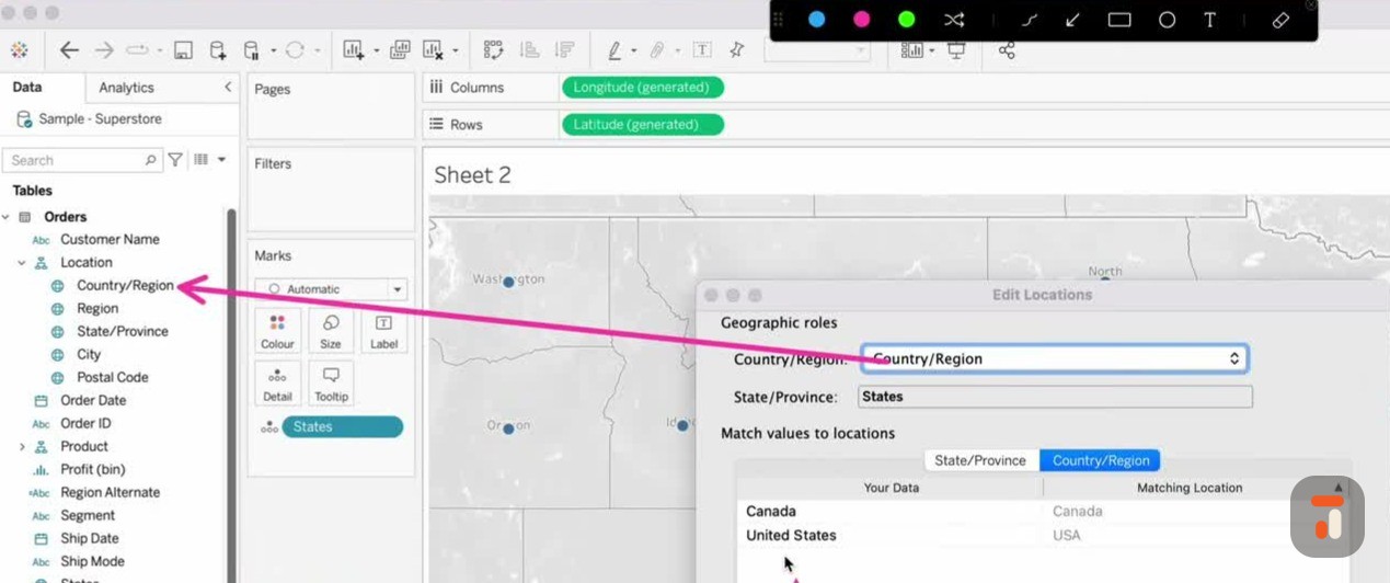
Here’s the bit everyone misses. Down in the bottom right you may see a message saying there are unknown places. This typically happens when locations share the same name in different places, so Tableau needs one extra piece of information to identify them.
Click the unknown count and you get options: edit and correct the locations manually, filter them out, or show them at the default position near the equator, which you don’t want. Choose Edit Locations and you’ll see all the unrecognised states. Tableau is assuming the country is the USA, but if your data also contains Canada, that assumption isn’t good enough. You can tell Tableau to use another field for the country information. Since we already have a country/region field, pointing Tableau at it instantly clears up the ambiguity.
Hit OK and the map redraws, the unknown message disappears, and the Canadian locations appear. From there you can turn it into a filled map, add a white border to separate the states, bring State onto the label, and play with the background opacity and style to make the map more prominent. You can even switch to outdoor or satellite maps and toggle water, neighbourhoods, subways and roads, all at your fingertips.
This really only scratches the surface. If this is your first map, finish it off and then explore the many other mapping videos out there to go deeper.